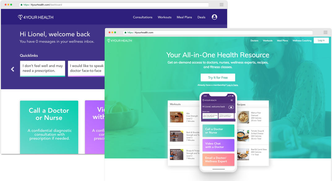
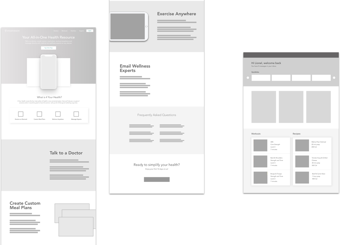
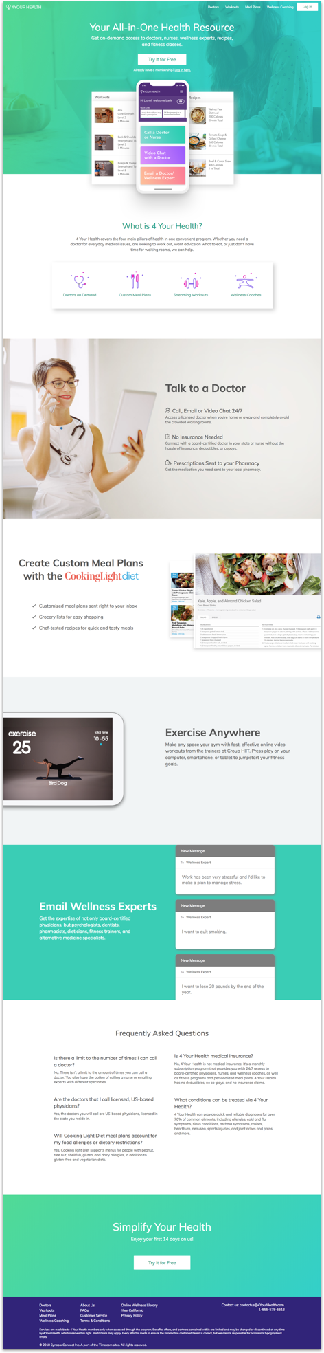
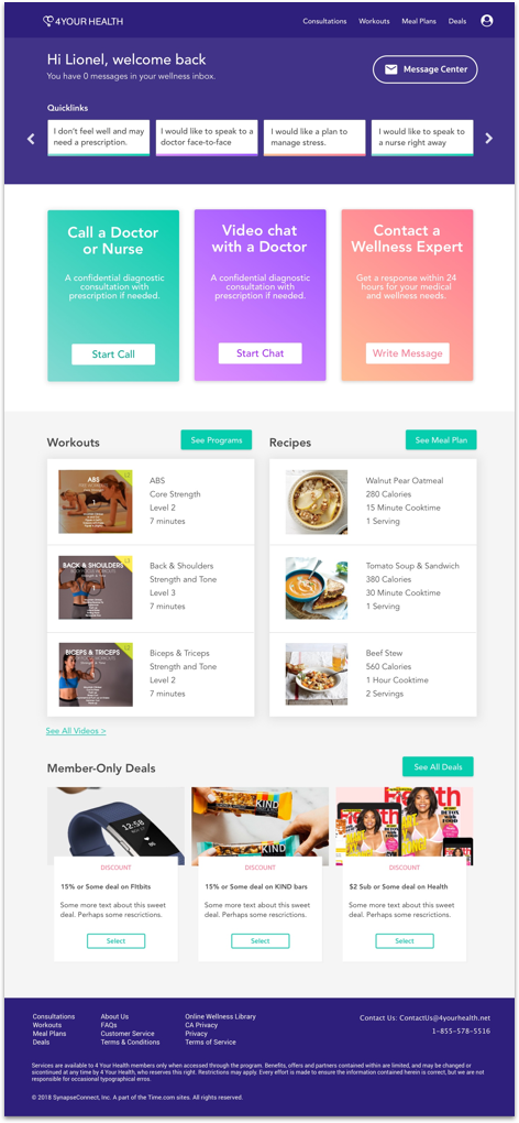
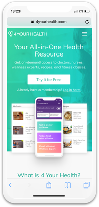
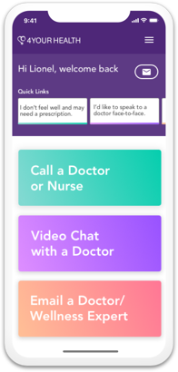
PHOEBE ATKINS

4 Your Health

4 Your Health is a wellness application that aims to simplify health needs. It does this by providing video chat with doctors and wellness coaching, as well as by creating personalized meal plans and workout programs.

Project Overview

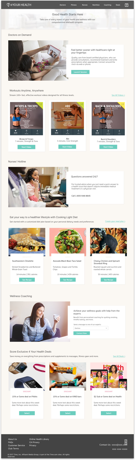
The design challenge was to make this health and wellness application have responsive web pages and a comprehensive members dashboard where--in one place--users could initiate consultations with doctors via video/phone, create custom meal plans, watch workout videos, and access wellness coaches.

  • Involvement

    • UX/Product Design Lead
    • UX Research Lead
    • Front-end Development Lead
  • Company

    • Synapse Group, Inc.
  • Year

    • 2018

My Role

As the UX Design and Development Lead, I conducted user research and usability studies, wireframed and designed the User Interface and developed the front-end (HTML, CSS, JS). My team and I built this product from the ground up in a few months (including the re-design) while working closely with business, marketing, project management and software engineering teams.

4 your health final design
Final design of the homepage and members dashboard for 4 Your Health.

UX Challenges

There were two main challenges to this project. The first was to create an aesthetic and message that would accurately convey our value proposition to a diverse group of users. The second was to seamlessly integrate the services of multiple vendors in the same easy-to-use dashboard.

Understanding the Landscape

My team and I created a questionnaire and presented it to a random selection of people. In addition to gathering demographic information we asked about opinions and habits regarding health and wellness. We wanted to know, for example, what people’s main obstacles were in seeking medical attention and how often they worked out or cooked meals at home.

Initial Attempt

I wireframed and designed the homepage and dashboard using the information gathered from market analysis and user questionnaires.

initial 4yh wireframes
Homepage and members dashboard wireframes for initial 4 Your Health design.
initial 4yh landing design initial 4yh dashboard design
High fidelity design of 4 Your Health homepage and dashboard.

User Testing

After designing and prototyping the homepage and dashboard (using HTML, CSS, and JS), I conducted usability tests to gain an understanding of how they performed. Here are a few of our key observations:

Insight:

Our headline made it seem (erroneously) that this was a website that provided healthcare coverage.

Solution:

We created a more direct and descriptive headline/subhead. We also moved away from aspirational imagery and toward a focus on the product.

Insight:

Users were having to wade through too much text to locate the benefits of the product.

Solution:

We added a prominent “What is 4YH?” section before explaining the benefits of each feature.

Insight:

We noticed that on the member’s dashboard users were having trouble determining where to begin, even when they had a specific task in mind.

Solution:

We created quick links at the top with the most common-use cases that connected to their respective services. We also added the “doctor consultation” links in a visually prominent place.

When at first you don’t succeed…

With these insights and solutions in mind, we decided to rethink our messaging and re-design the website to be more direct and product-focused. User-testing helped us understand the specific challenges users were having with the app. It also gave us the idea to create an aesthetic that was brighter, cleaner, and more aligned with the look and feel we were after.

4 your health icon set
Custom icon set for final 4 Your Health design

Final Design

We addressed the initial usability concerns discovered through our user testing before it was launched in beta in December 2018.

4yh final wireframe designs
Homepage and members dashboard wireframes for final 4 Your Health design.
4yh final landing design
4yh final dashboard design 4yh coming soon design 4yh final mobile landing design 4yh final mobile dashboard design
Final designs for 4 Your Health homepage, members dashboard, beta release page, and mobile views.
←Previous Project | Next Project→